For this project i did:
Journey mapping, storyboarding, interaction design, user tests, prototyping, ideation, co creating with stakeholders, stakeholder management, usability research.
Tools: Figma, Miro, Procreate
The Design challenge
Make the registration and identification of employees fully digital so that they don’t need to go to a branch office
Core team: 2 designers (UX and UI) responsible for mobile app , 2 designers (UX and UI) responsible for web, 2 tech leads (architects) responsible for web and app respectively, a product owner, a business analyst
Product teams involved: : Mobile app team, Web team, UX research team
My role
As lead designer for the mobile app product team at the time my role was to translate the physical onboarding into a digital flow on the Randstad mobile app.
What i did: Represented the design team in a weekly meeting with the core team experts to coordinate and update each other, ideated on solutions with the design team, took part in design jams and design critiques, created a user journey and storyboard, contributed to user test scripts and helped analyse user test observations to get actionable insights.
The Background
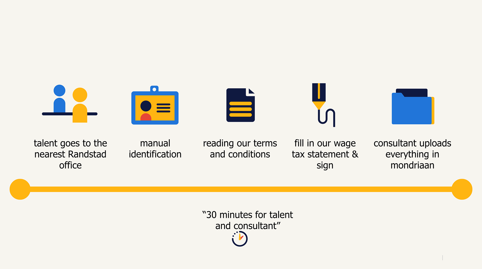
When a new hire starts a job through Randstad, they are registered in the Randstad systems for legal and tax purposes. This process, known as onboarding, involves identifying the new employee through their ID, verifying their information, and having them sign their contract.
Previously, this onboarding process required meeting with a recruiter at a Randstad branch office, which candidates and recruiters considered a significant hurdle. Scheduling a meeting that worked for both parties, as well as the (travel) time involved, often resulted in candidates starting their job later, or sometimes dropping off the process.
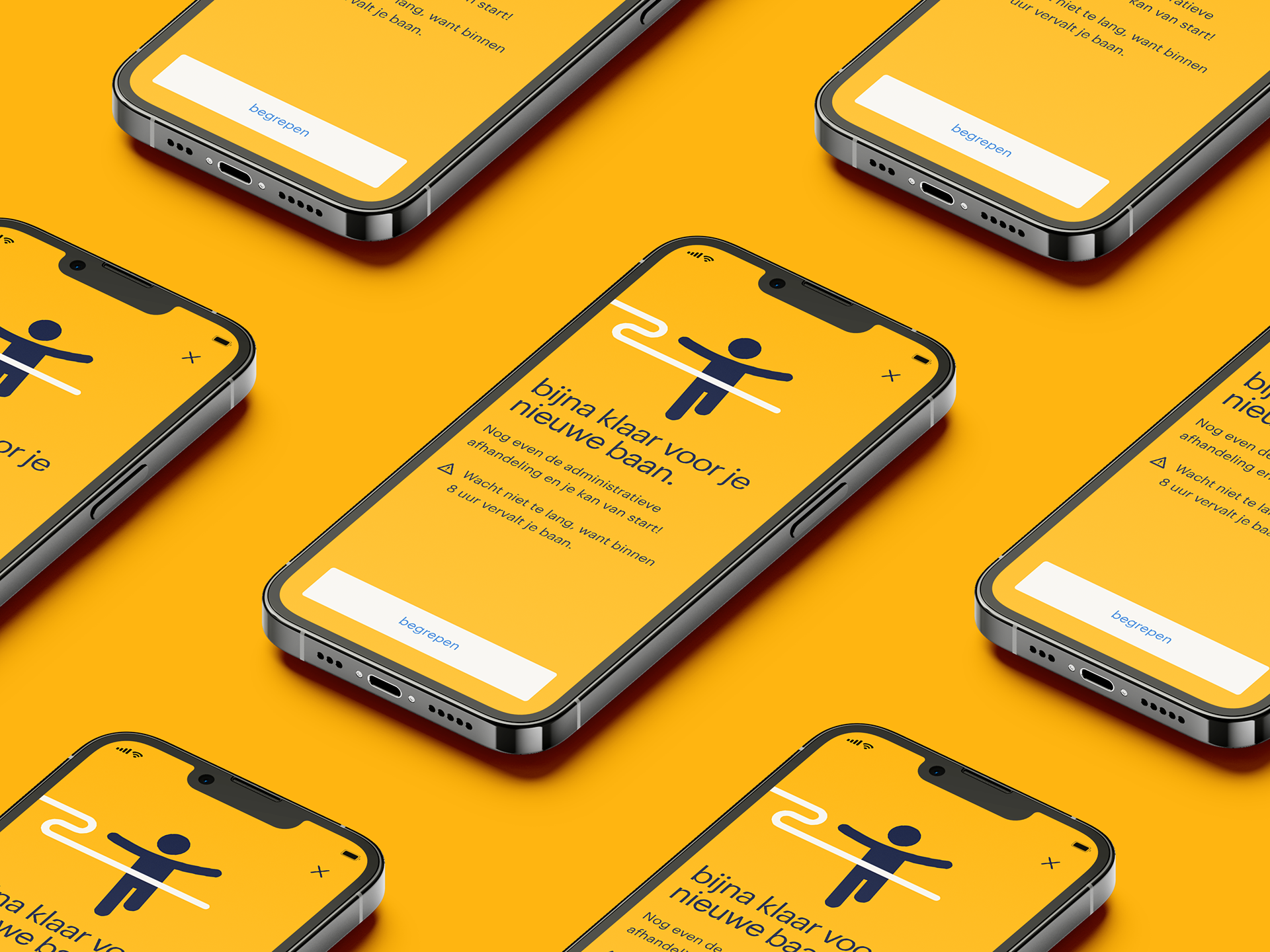
To address this issue, Randstad wanted to offer the option to complete the onboarding process entirely remotely. This wish was expedited when branch offices were closed due to COVID-19 lockdowns.

Before
Registration as an employee for Randstad took about 1 to 5 days in total.
The employee had to be physically present at a Randstad branch office.
The recruiter had to routinely spend time on manual registration of employee data
If a candidate hadn’t been registered yet, they were more likely to be rejected for short jobs or gigs due to the time involved in registering them
Candidates would sometimes try to expedite the process by sharing their legal documents through email or Whatsapp, which wasn’t legally compliant
After
Digital registration as an employee takes about 10 minutes in total.
Candidates can register for their job anywhere as long as they have a smartphone
Time-saving for all recruiters is estimated at 75 hours per week.
After finishing the onboarding, employees can start their new job right away.
Legally compliant by working with third-party software that has government approval to handle legal documents and identification
The user has a choice between offline or online onboarding
The Process
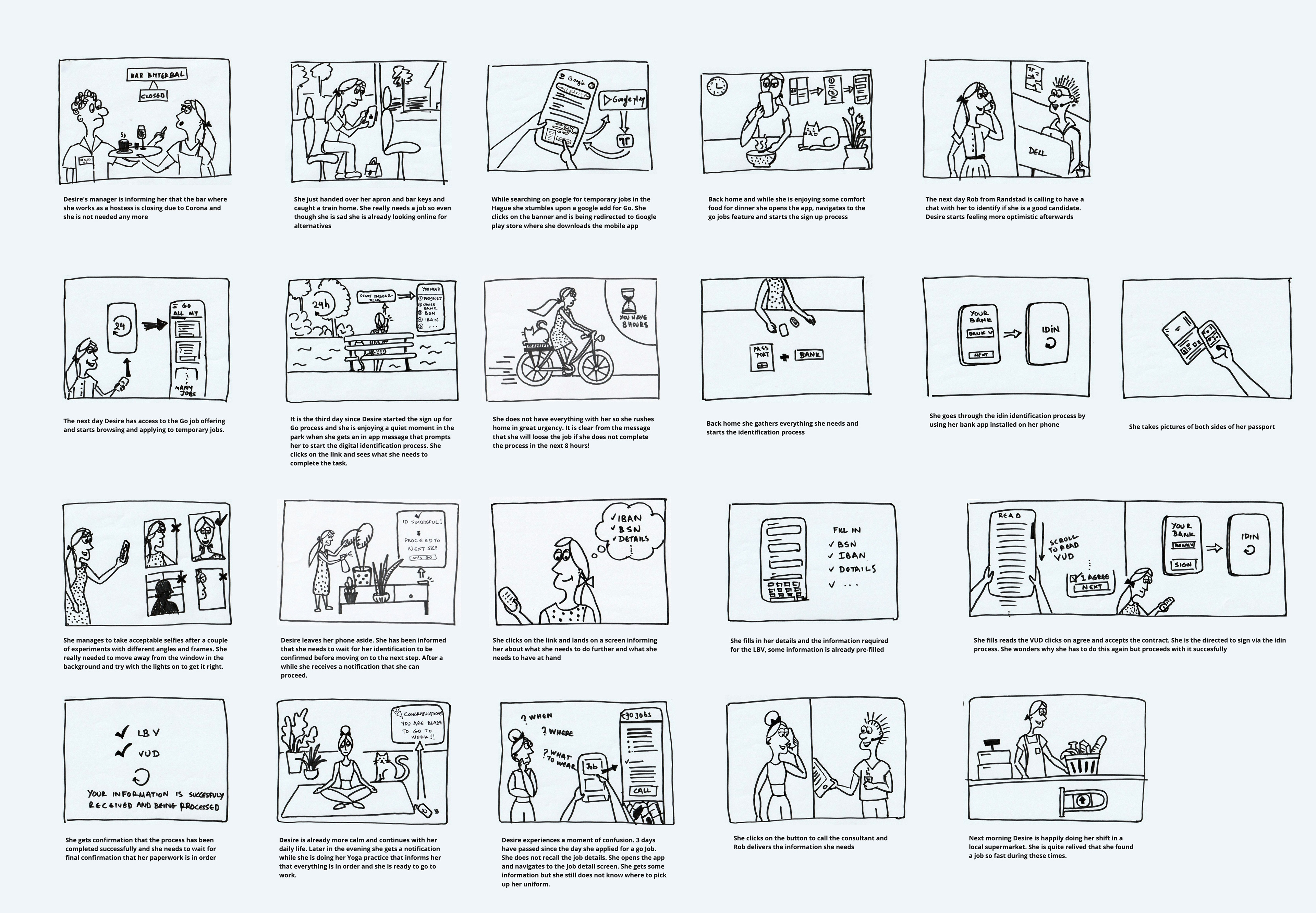
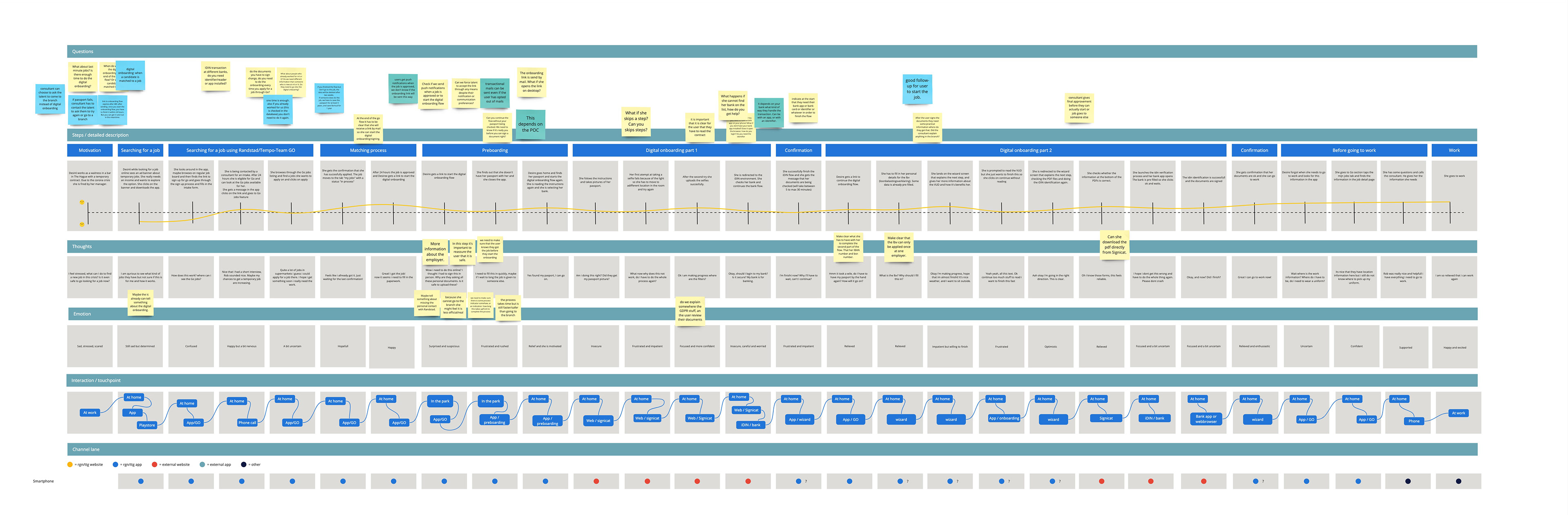
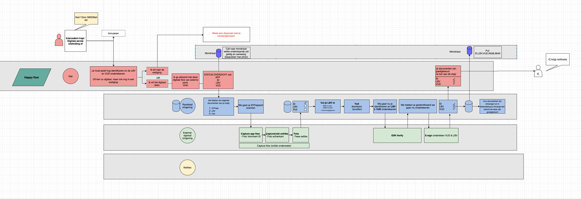
Story board and Journey mapping
To get a sense of our user’s context and experience how it ties into starting the onboarding flow I mapped the user journey together with one of the web designers to get all the cross channel steps right. The journey is showing the user’s perspective as they are starting to search for a new job, all the way to their first day at the new job.
At the same time I created a storyboard focusing on the onboarding part of the journey to help everyone working on the project understand the complicated process better.
The story board was used multiple times as a way to empathise with the user by showing struggles the user is having in everyday life context.
Both of these visualisations helped me better communicate user needs to stakeholders, and convince them to simplify some of the back-end processes. They also provided some insights we could act upon.
What we all learned guided the design and testing strategy that followed.
Trust is important:
Performing all of these sensitive steps online may be unfamiliar to our users and may cause them to distrust the process as they are required to upload a lot of sensitive personal information. How can we assure them that it is secure?
Waiting time can cause drop off:
There are moments when the user has to wait for the back end to process something. If this takes too long, they might leave the app. Can we work with tech to let users continue with the process while certain things happen in the background?
Set up the user for success:
Set up the user for success:
The user might not have their ID with them, but when they start the flow they have a set amount of time to finish it. To prevent this, we designed a checklist at the start of the flow, so users don’t accidentally start the flow without being able to finish it.
Understanding the back end processes
As only a few companies have government approval for processing legal documents and digitally signing contracts, the flow had to be built around the processes of several third parties. We worked with the tech leads on this project on a functional design document to understand these processes and see where there was room for flexibility and changes in favour of the user.
Design explorations and testing: an iterative process
First user test
There were many questions and gaps in our knowledge, the best way to address that was to flesh out the flow in a simple prototype and ask the users what they think. The flow used in the prototype for this study was intentionally kept very basic and was based mostly on the back-end processes. The research purpose was to get a sense of how users perceive digital registration and find their biggest pain points:

What we learned:
Trust: Switching between the Randstad app and the mobile sites of several third parties undermined users' trust in the process. They also felt less confident doing this digitally than talking to a person.
Security and privacy: Users were concerned about what would happen to their data, and how safe it would be if processed digitally.
Unclarity: Users often didn’t understand why they had to do certain steps, eg. they thought taking a selfie was for a profile picture, but it was to compare to their ID picture
We solved these by adding:
In-between screens acting as a visual separation between different steps in the flow. These screens also announced the switch to a third-party site, with some background on the third party and an FAQ explaining unfamiliar legal terms.
A dedicated moment in the flow to explain what Randstad uses the user’s data for, and, even more importantly: what it is not used for.
An overview at each step of what is going to happen next, and why.
Finally, we spend special attention on offering users a way out if they get stuck in the process or prefer to talk to a real person.
Second user test
The second user test focused on testing the usability of the complicated process of scanning legal documents and identification. Part of the study was the ‘non-happy flow’: the error flows designed to help out users who get stuck at some point.
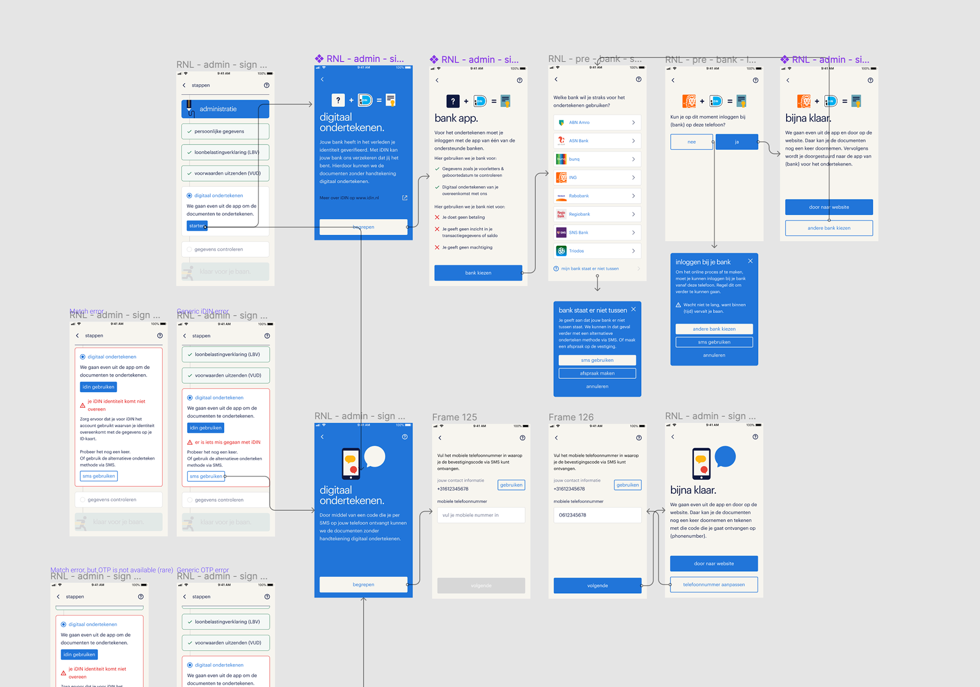
Some of the insights of this study:
Dialogue:
Users reacted better to steps that were presented as a dialogue. Eg. Do you have your passport with you? Yes/No”
Lost in the process:
Users still felt somewhat lost in the complex process
Communicating criteria:
The underlying software required the user to take very specific photos of their legal documents
As a result of this study, the design now featured:
A progress indicator to show the user which steps they (still) had to do and their progress so far
Animations and illustrations to explain how to scan their documents
Gentle nudges in the interaction to help users take the right picture
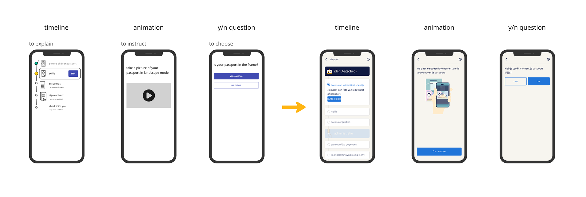
The flow by now featured three types of screens:
timeline or in-between screens (to explain), animation or illustration (to instruct) and dialogue (to choose)
Test with a real app
How is digital onboarding perceived?
After several iterations and tests, we organised a user test with a test app instead of a prototype to understand the impact of the back-end processes and any delays caused by them on the user’s experience. Our aim was to test the solutions we had designed to tackle the design problems uncovered in the previous studies.
Outcome of the final tests with the app:
The trust and ease of use had significantly improved. One user commented that “it feels just as safe as going to a branch office”. The step indicator was especially helpful in this as it tied all the third-party processes together.
Animations and illustrations were very helpful in making it easier to take the right pictures and follow instructions.
Users struggled with having to turn their phones horizontally for certain pictures. With the tech lead, we were able to persuade one of the 3rd parties to keep the phone vertical, no matter the picture.
Impact
The end result of this project was a digital onboarding flow that allowed new hires to register themselves for their first job through Randstad, without having to visit a branch location. By now:
85% - 95% of talents are able to do their full administrative onboarding digitally within 10 minutes in our app (both Randstad and Tempo-Team talents).
The completion of the registration takes users around 10 minutes
Time saved for recruiters is approximately 20 minutes work per placement
New hires get a smoother user experience
The company is fully compliant as new hires no longer send copies of their documents through whatsapp which whas the case before
“ Takes 10 minutes and we don’t have a lot of issues, it is explained well and easy to follow. If applicants have issues it is usually that they cannot find the email to start the onboarding flow” _ recruiter testimonial
Next steps
After the successful launch of this flow for Randstad Go in April 2021, the flow has since been made available to all eligible employees through the Randstad & Tempo-Team apps. To this day, the flow is being expanded to include applicants holding both EU and non-EU passports.