For this project i did: UX design, interaction design, visual design, information architecture, user research, stakeholder management.
Tools: Figma, Miro
Why redesign the global navigation?
We needed to improve our search engine ranking and get more page visits.
The global navigation was not scalable. There was a finite amount of menu items that fit under the primary sections in the top navigation bar.
The process
The global navigation was redesigned following the double diamond approach. This widely known framework takes you from a problem to a solution following the steps of discovery, definition, exploration and execution.
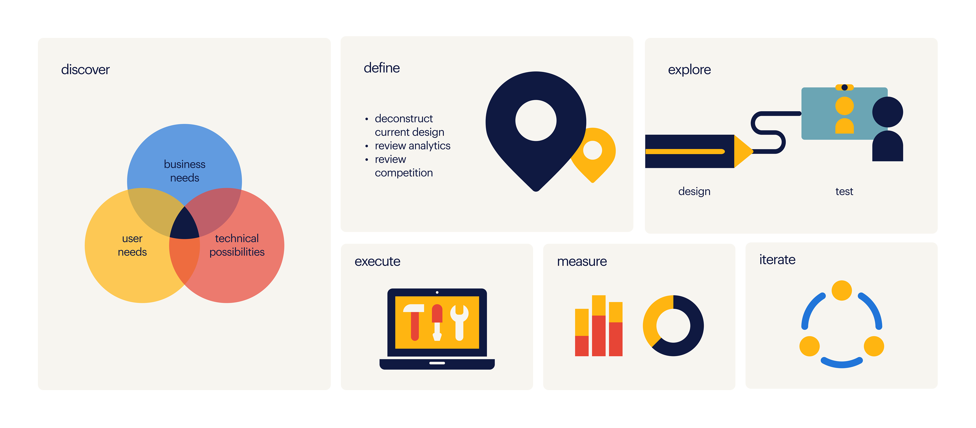
Discovery:
First step was to build a shared understanding on the why of this initiative and scope it. I did this by speaking with the stakeholders from all the teams that would be affected representing business tech and design and reviewed past user research we had done on navigation in both web and mobile apps to get the user’s perspective.
Opportunities defined:
Create a scalable design with more space for links
Improve usability by having more space the user can navigate in and introducing delays so that the user does not accidentally trigger hover effects without wanting to.
Accessibility: Improve legibility by presenting all the navigation options on a light background with dark blue typography regardless of the page header background, thus increasing the colour contrast.
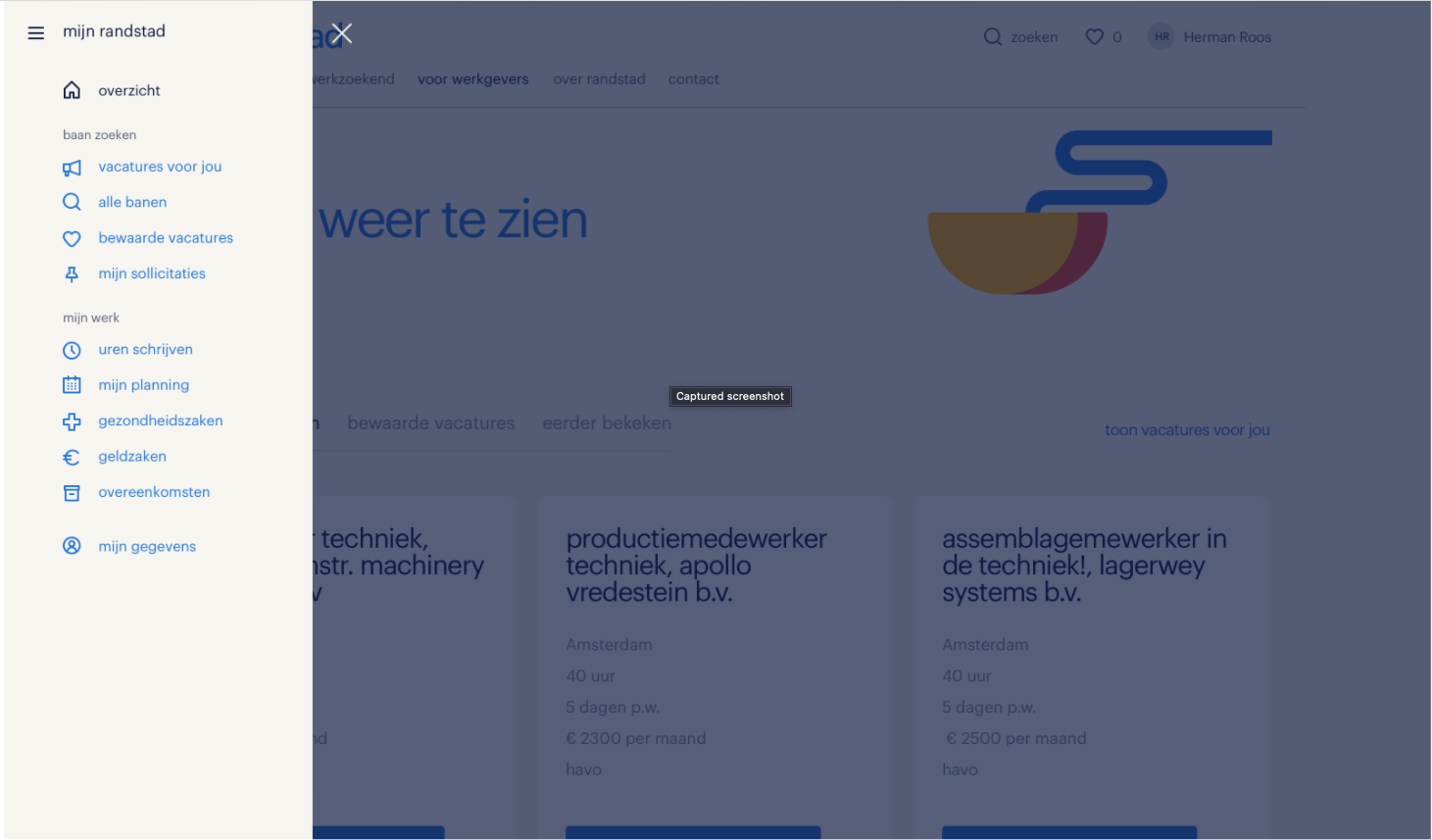
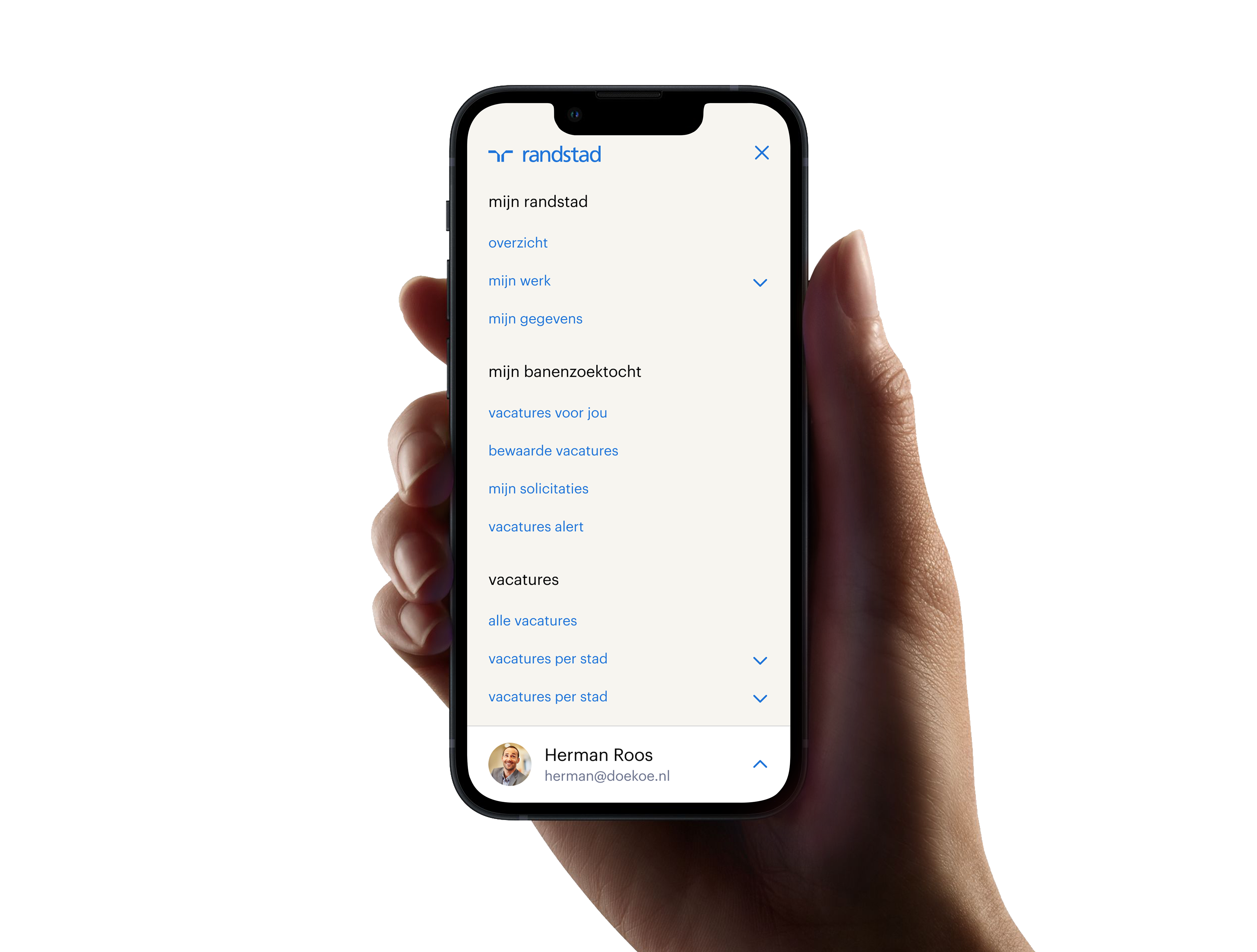
Mobile navigation: Create a design that gives a better overview of the options available and is consistent in both logged in and public environments without forcing the user to click through many layers of navigation
Consistency: improve the information architecture and introduce more links in the logged in environment that are relevant to the users which they could not access before unless they logged out.
Efficiency: Build one solution that is going to be used for both public and logged in domains. This way we will not need two product teams maintaining it and we can have more control of the feature and the content displayed.
Exploration and testing
Design explorations yielded two directions: a split navigation solution and a top navigation solution. The first solution groups the logged-in environment links in a sidebar while placing public content links in the top bar. The sidebar was only visible once the user accessed the logged-in environment. In the second version both logged-in and public domain content was placed in the top navigation and was accessible through a big drop down.
Test insights
For this project we did two consecutive user tests: One to define the design direction (split navigation versus only a top navigation) and another one to focus on the menu content structure.
During the tests, we asked participants to find where they could do a specific action such as filling in hours, finding interesting vacancies, finding a local Randstad office, updating their CV or finding the status of their applications.
Design direction key insights:
Users with an account expect to be logged in and see a difference between the logged-in environment and the public website
Speed and accuracy are most important when navigating
The consistency of the menu between app and web is important, because it creates a sense of familiarity.
The split menu received more positive feedback, important aspects being: clarity, speed and accuracy and similarity with the menu in the app. However the result was not conclusive since most of our participants where app users and had an account with us. This made them more biased towards the split menu design direction.
Content structure key insights
Some users could navigate the menu more easily than others, however, there was no reason to believe that the prototype menu would cause significant issues navigating for those who were not as proficient.
Users expected that they could log out in the first level
Users expected personalised content when logged in and they preferred to find it on top of the list in the global navigation
Execute
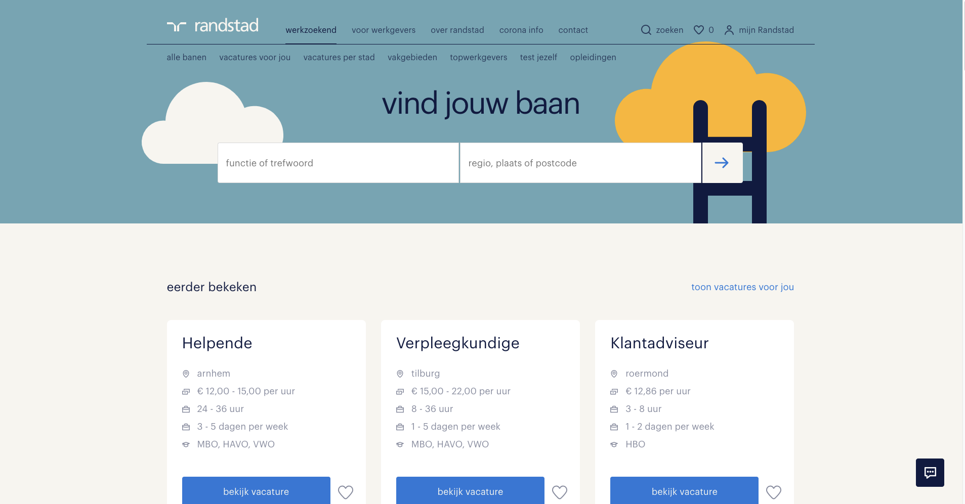
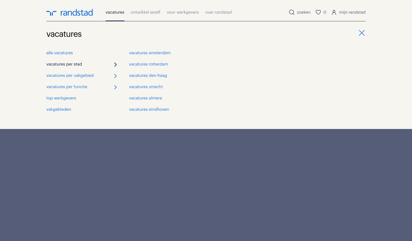
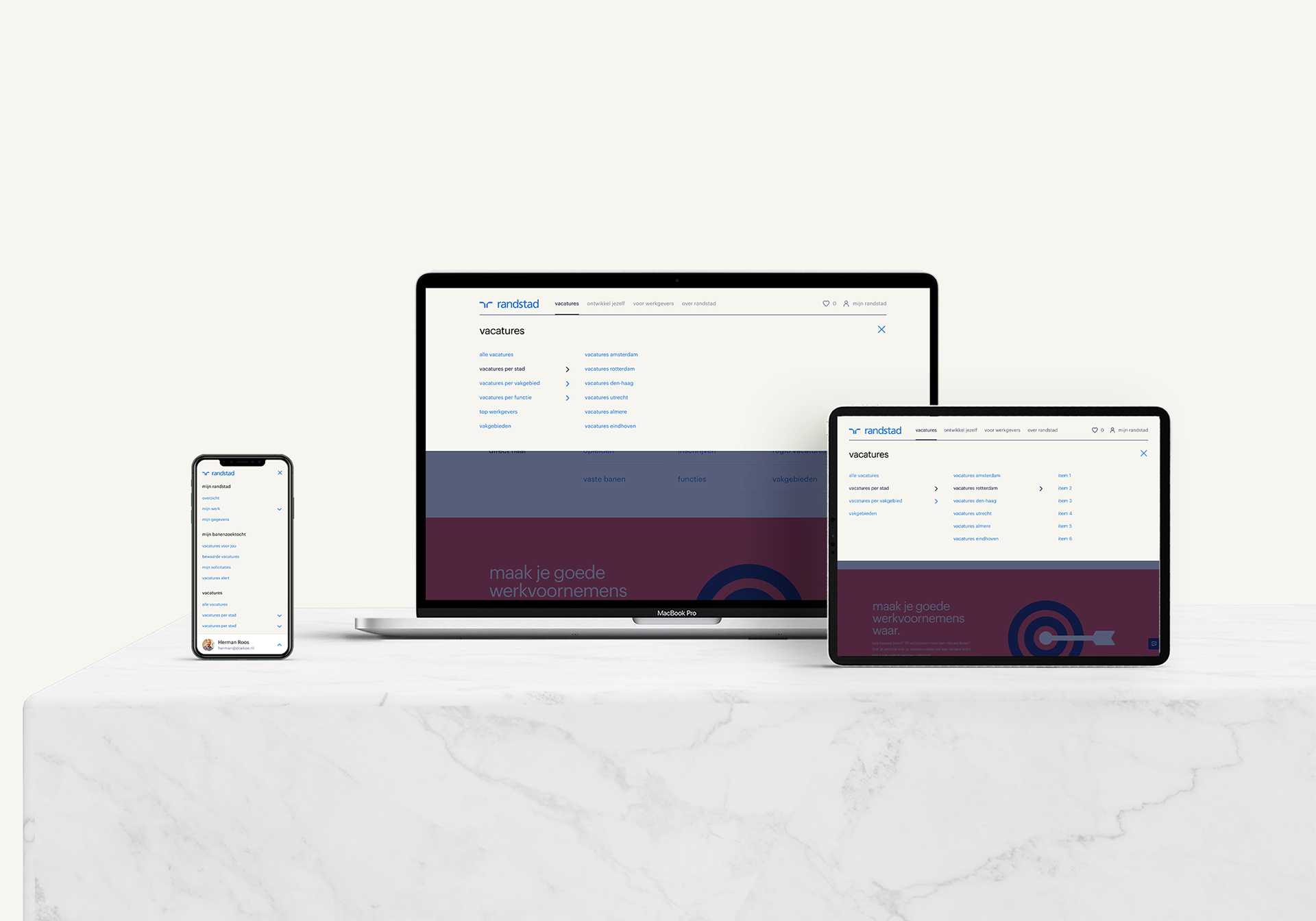
On desktop the final solution is a big dropdown displaying the title of the section with big bold typography befitting the house style and a vertical list of links that can be clicked when a chevron is next to them and expand horizontally in the next column. This menu can potentially go four layers deep though we will constrain it to three lest it becomes too much of a maze for users.
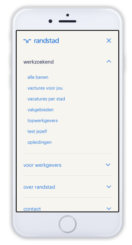
I used insights from past research to make some improvements in the mobile navigation. We observed that users preferred to have a better overview of what is available while scrolling a list instead of having to click through cascading links to reach the content they were looking for. Guided by this insight I chose to have the links visible up to the 2nd layer of navigation. A bottom sheet is added to help the users access the settings and account menu on mobile devices easier and save some scrolling.
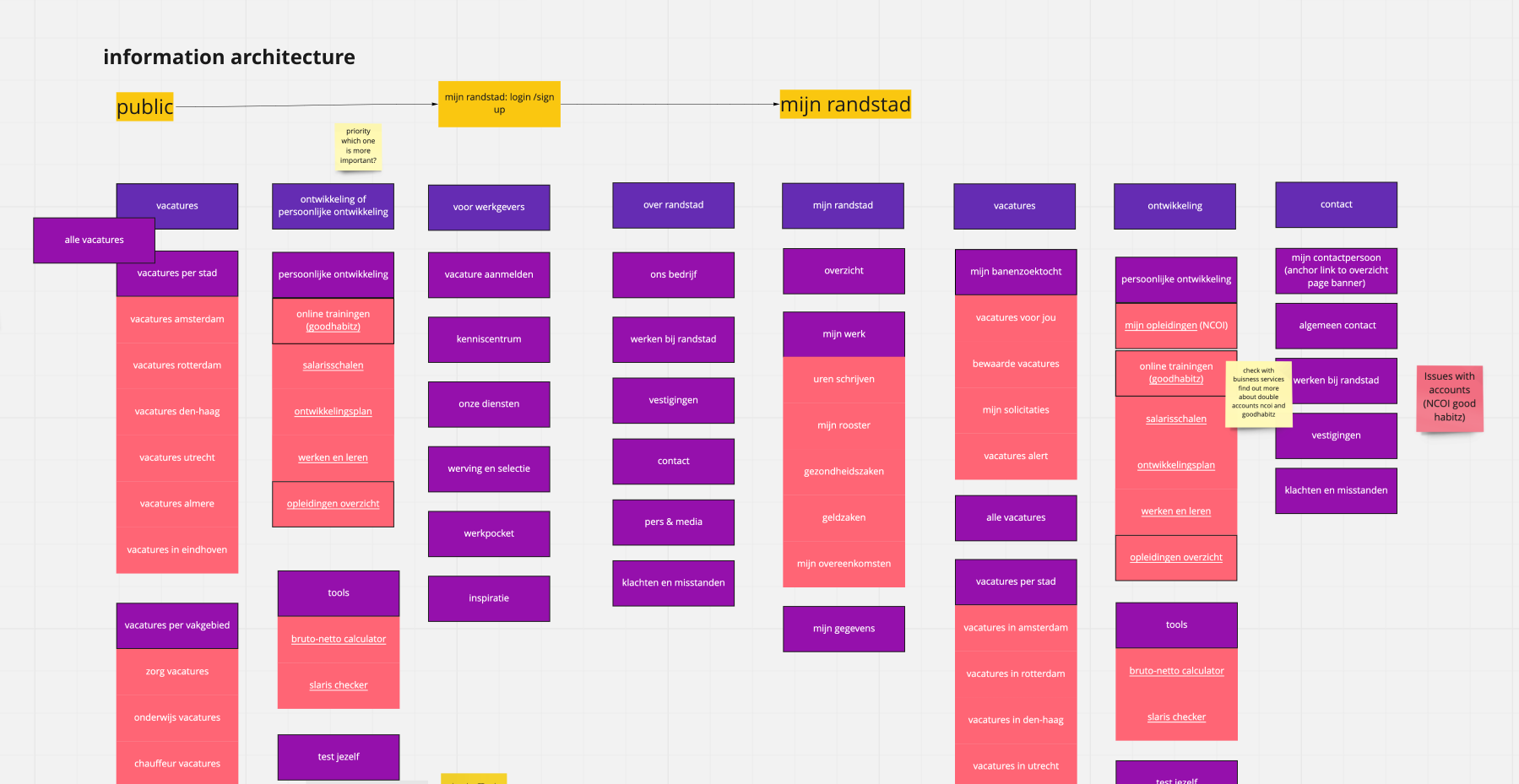
Information architecture
I had a lot of talks and interactive sessions to address the best way to get more SEO value from our menu, take all stakeholder’s wishes under consideration and at the same time try not to compromise the user experience.
The final decisions are based on requirements, business wishes and past user research (card shorting sessions). This combined with the collective knowledge and needs of the stakeholders involved led to the redesign of the information hierarchy for both logged-in and public environments.
Measure
The new global navigation feature is now live on the public and logged-in website and improvements are scheduled for the next sprints.
I am getting together with the experts to devise a plan on how to measure the performance from both SEO and usability perspectives.
Next steps
We already see that people are clicking on the top navigation links and expect a landing page that is not there anymore so our next step is to design a solution for that. Any other red flags will be addressed in the future as we monitor the features performance through analytics and the improvement cycle will continue.
LINKS
For more information on my process you can read my article on medium:
If you want to interact with the feature: